Boost Your Social Media Engagement: Essential Tips for Enhanced Posts

Boost Your Social Media Engagement: Essential Tips for Enhanced Posts
Being visual on social media is not a new thing. Graphical content helps express ideas quicker than text and connect with the audience. People seem to be more comfortable with images and infographics than written content.
So, it needs no saying whenever you are posting graphical content, you are competing against thousands out there who want just the kind of attention you do. With that being said, what is the strategy that will make your one special?
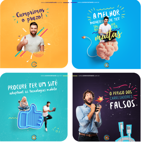
Social media is an important part of any marketing strategy but some marketers overlook the importance of social media design. Social media posts have limited real estate and so your post must be designed to grab your audience’s attention.
This article is all about giving you an idea of how you can prepare your graphical content to get more attention on social media. Here are 9 designing content for social media that will make your posts more captivating than ever before.
Importance of focus on social media posts
It’s no secret that social media is a powerful marketing place. But did you know that your posts’ designs can make or break your chances of success? Investing in creative and relatable social media post design will make content more likely for your audience to remember you.
A good design communicates your brand’s message more easily to the audience and puts you one step ahead of your competition. Design is essential to successful marketing efforts. So if you want to give your social media posts the best chance of success, focus on creating good designs!
- They’re more likely to share them,
- Increasing the visibility of your social media content and posts
- Good design equals high engagement.
1. Be Careful While Choosing Background Images
Have you ever realized how social media posts look so clean and to the point? One of the reasons is – choosing relevant background images. You cannot fetch an image of the ocean if you are promoting your coffee shop. Find something that will reflect the theme with its elements.
Copy space is a term that refers to the space in images. You must choose images that have proper copy space. This is very important as you don’t want to put texts inside images that don’t push the message forward.

2. Choose Your Fonts Wisely
Fonts are a great part of your overall branding. You cannot use random fonts and keep changing them in every post. A font can carry the personality and character of your brand, so choose your fonts wisely.
While designing images for your social media, you can always divert from your regular brand fonts, because they should be according to the type of audience you are trying to connect to, not your brand’s consistency. But, don’t keep changing them very often.

3. Determine a particular layout
Layouts define the elements of your graphical content’s position. Just like your fonts, your layouts need to be consistent as well. Think of it as a great way to grab your audience and pass the message quicker, because they will recognize it more quickly if they see it in a familiar layout.
Try to build a common theme and a layout that suits your brand. While the dimensions for each social media are different, you need to think of something versatile. It is a time-effective process that will enable you to boost your engagement with the audience.
4. Always Go With The Brand Colors
If there is something that can connect with your audience other than words, it is color. Your brand colors not only reflect the purpose and feel of your brand but also influence the psychology of the observers. If you are trying to determine the right colors for your brand, be sure to ask yourself these few questions first-
- Who am I trying to reach out to?
- How do I want them to feel about my brand?
- Is my brand feminine, masculine, or generic?

The colors should speak to your aim and personality. Having said that, how many colors should you choose?
That depends on your brand. However, it is common for brands to have at least four different colors that look good together in combination.
The same colors will be used in social media. You should include them in your infographics, logos, and any other social posts that involve visual content.
5. Try To Be Graphical With Infographics
Infographics are a very effective way to connect with your audience through social media. It is seen that brands using infographics get 12% more traffic than brands that don’t. Whenever you get a chance to present your message using text, images, and icons, don’t waste your opportunity of doing that by not using a great infographic.

6. Don’t Forget To Use Your Logo
The logo isn’t something you try to slip into your social images. It should have a consistent place and size of its own. Try to keep the size and the position of your logo fixed while using it in graphical content.
A logo’s position should be determined when you are working on your post’s layout. When you are thinking of that, you should also think about your logo, its alignment, and its dimensions.
It is important, but not the most important thing in your post!
Remember, if you are trying to send a message through your post, the audience should watch the message first, and traditionally the logo should come up at some point.
7. Resize Your Posts According To Different Social Media Platforms
Surely you don’t use a single social media platform for promotions. There are lots of these nowadays, like – Facebook, Twitter, Instagram, and Pinterest. All of these have their photo dimensions. Optimize your images according to each of their preferred dimensions before posting.
Designing photos and resizing them every time you create one can be time-consuming. The best practice most brands follow is that they create templates that are generic to one particular social platform. Whenever they create a post, all they need to do is optimize.
8. Select the right graphic elements
Adding the right graphic elements to your posts can make a big difference in how they look. You may think that lines, graphics, animation, etc., are outdated, but that’s not necessarily true. When you add these lines, shapes, illustrations, and more to your posts, you can enhance their appeal and make the audience more likely to enjoy your content.
You can use arrows, boxes, and some shapes to highlight the most important information. This will help guide your readers’ eyes to the most important parts of your post so they can quickly and easily understand what you’re trying to say.

9. Post content accordingly to Channel
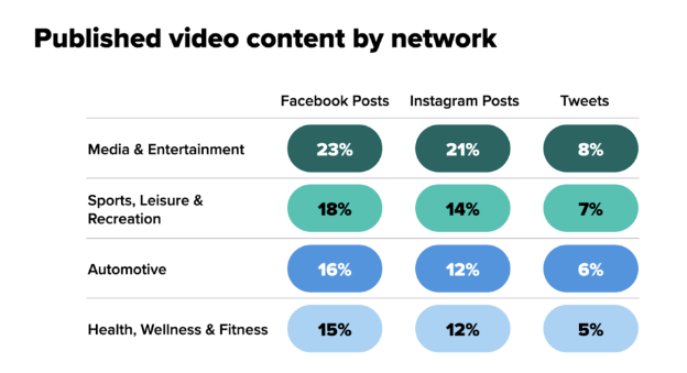
Different social media platforms have different types of audiences. And therefore, you must tailor your content to fit each platform accordingly. For example, Instagram is more about visual content, so you must treat your audience with more eye-appealing visual content.
Similarly, Facebook is more image content and text-based, so you must focus according to the content there. Likewise, LinkedIn is more professional text-based content. By knowing which platform the target audience is most active on, you can better engage with them and produce the results you want!

Conclusion
When it comes to designing your social media posts, it can be difficult to keep them unique. So today, we have outlined social media design tips that will enhance your posts. With this knowledge, we know that you can grab your audience’s attention with a post that is designed. So what are you waiting for? Start implementing these tips today!
